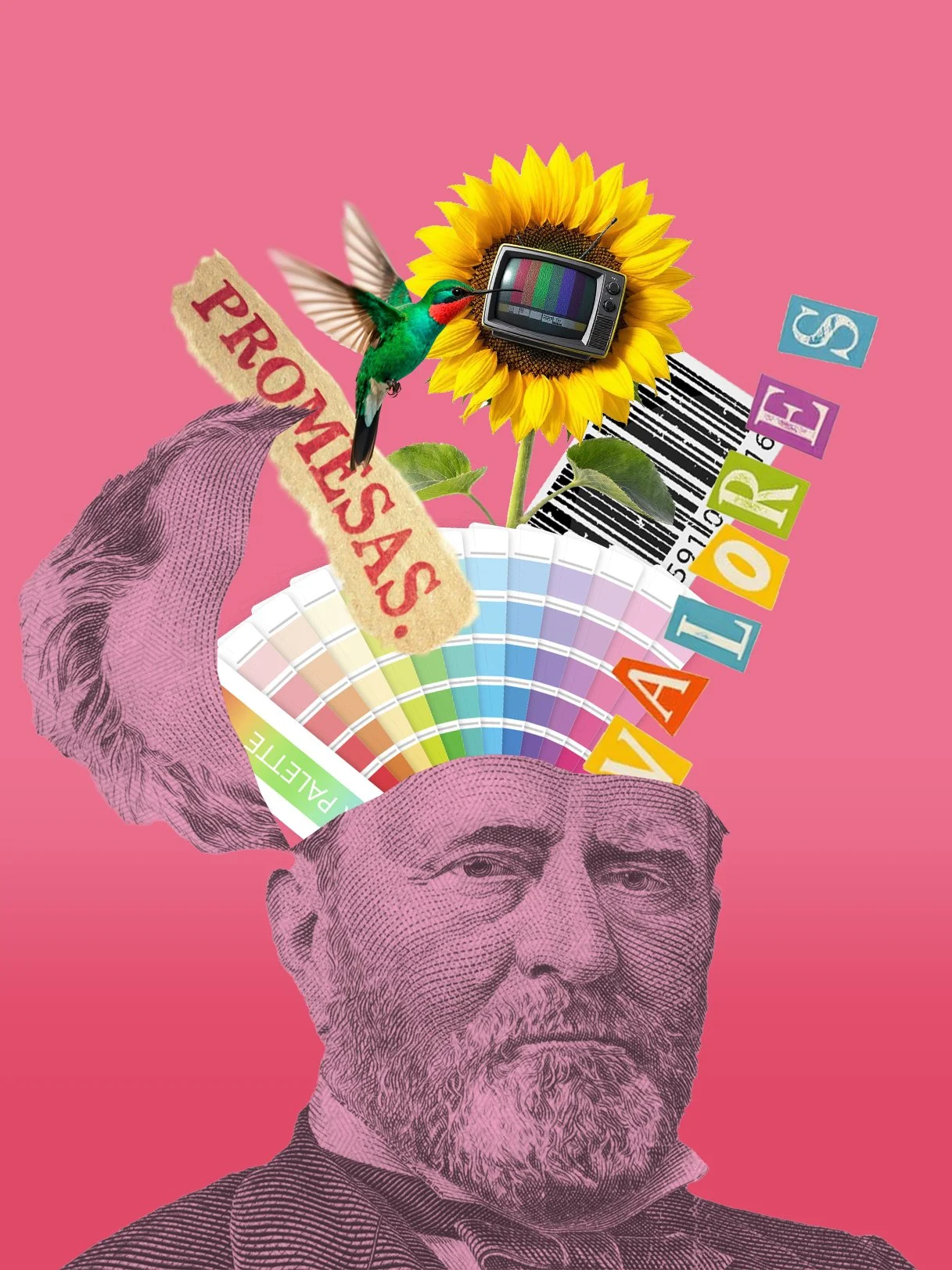
Brand consulting in Madrid
Brand consulting is the starting point for companies that need strategic clarity before investing in communication or design. Razonable works with marketing directors in Madrid who are looking for diagnosis, positioning, and brand architecture with a B2B focus.
Complete brand audit: Analysis of internal and external perception, competition mapping, evaluation of consistency at points of contact.
Definition of strategic positioning: Identification of real differentiators, unique value proposition, and communication tone adapted to the sector.
Brand architecture: Organization of sub-brands, product lines, and hierarchies as the company grows or diversifies.
Brand platform: Strategic deliverable that includes purpose, values, personality, attributes, and brand narrative.
Each consultancy includes project sessions, executive presentations, and clear implementation guidance.
Rebranding of companies in Madrid
Rebranding is not just changing the logo: it is rethinking the brand from its purpose to its visual expression. Razonable manages rebranding processes for SMEs and B2B companies in Madrid facing market changes, mergers or strategic evolution.
Rebranding of SMEs in Madrid with brand audit included: Previous diagnosis, transition strategy, identity redesign and change communication plan.
Corporate identity redesign: Updating of visual system, palette, typography, applications and complete brand guide.
Internal change management: Communication to teams, training in new values and support in the progressive implementation.
Especially suitable for technology, fintech, health and professional services companies in downtown Madrid, Chamartín and business areas in the northwest.
Packaging agency in Madrid
Packaging design requires strategic vision and technical knowledge. Razonable works on packaging projects for food, beverage, cosmetic and artisan brands in Madrid.
Food packaging design in Madrid: Differentiation strategy on the shelf, structural design, graphics and coordination with local suppliers.
Beverage packaging in Madrid: From craft beer to vegetable beverages, design that connects with the final consumer.
Wine label design in Madrid: Labels that transmit origin, quality and personality of the winery. Coordination with specialized printers.
Cosmetic packaging: Sustainable, elegant and functional design for natural or premium cosmetic brands.
Sustainable packaging design: Selection of recyclable materials, ecological inks and certified suppliers.
Each project includes prototyping, consumer validation and production follow-up.
Naming agency in Madrid
Naming is one of the most critical decisions in the launch of a brand or product. Razonable develops creative naming processes for startups, product launches and rebrandings in Madrid.
Creative naming in Madrid: Strategic generation of memorable, differentiating and registrable names.
Naming for tech products in Madrid: Names that work in digital environments, with available domain and linguistic validation in several languages.
Naming for startups in Madrid: Agile process adapted to quick launches, with verification of brand and domain availability.
Complete process: Strategic brief, creative generation, selection, linguistic validation, legal analysis and brand registration.
Especially oriented to technology, fintech, health and e-commerce sectors in Madrid.
Strategic branding B2B and for startups in Madrid
B2B companies need brands that build trust, credibility and differentiation from competitors. Startups need brands that scale fast and connect with investors and customers.
Strategic B2B branding in Madrid: Decision-oriented positioning, results-based storytelling and professional design without frivolity.
Branding for startups in Madrid: Scalable, flexible and ready to grow without losing coherence.
Branding for SMEs in Madrid: Professional branding without cost overruns, with clear prioritization of resources and focus on the essentials.
Projects developed for technology companies, consulting firms, agencies, SaaS platforms and professional services in downtown Madrid, Chamberí, Salamanca and Chamartín.
Projects by sector: technology, health care, food and real estate
Each sector has its own codes, references and expectations. Razonable adapts the strategic and creative approach according to the target market.
Technology brand consulting in Madrid / fintech / health: Brands that convey innovation, security and leadership. Focus on tech companies, digital platforms, healthtech and fintech in Madrid.
Branding for food and beverage: Brand strategy for artisan products, functional beverages, wines, craft beers and gourmet products.
Branding for cosmetics: Premium, natural or sustainable identity according to positioning. Differentiating packaging and coherent brand narrative.
Branding for real estate: Branding for developers, real estate projects and proptech in Madrid.
Each sector requires specific knowledge of its channels, customer pain points and competitive dynamics.
Branding and packaging study in Madrid: process and methodology
The project process project designed to minimize risks, maximize impact, and ensure successful implementation.
1. Diagnosis and briefing: Initial strategic session, analysis of the current situation, objectives, competition, and target audience.
2. Research and analysis: Brand audit, competitive benchmarking, trend analysis, and hypothesis validation.
3. Strategy: Definition of positioning, value proposition, brand attributes, and architecture, if applicable.
4. Creativity: Naming (if applicable), visual identity design, brand system, and key applications.
5. Validation and adjustments: Executive presentation, iterations based on feedback, and technical/legal validation.
6. Delivery and implementation: Complete brand guide, final files, internal training, and launch support.
Each project includes clear milestones, progressive deliverables, and strategic review sessions.
Why Choose Razonable as a branding agency in Madrid
Real strategic focus: We don't decorate brands, we build them from their purpose to their final expression.
B2B specialization: Experience in companies that sell to companies, where trust and credibility are critical.
Direct deal: No intermediaries or inexperienced juniors. You work with the project managers.
Proven methodology: Process validated in more than 50 projects for startups, SMEs and consolidated companies.
Knowledge of the Madrid ecosystem: We know the business dynamics of Chamberí, Salamanca, Chamartín, northwest business areas and technology parks.
Measurable results: Brands that impact perception, differentiation and business results.
Razonable is not the biggest or the cheapest agency. It is the agency that prioritizes strategic impact over visual decoration.
Branding agency close to business parks and hubs in Madrid
We work with companies located in the main business centers of Madrid: Las Rozas business park, Pozuelo, Alcobendas, San Sebastián de los Reyes, Tres Cantos and central Madrid (Chamberí, Salamanca, Chamartín).
Availability for face-to-face meetings at the client's offices or in our studio. Flexibility for hybrid projects (face-to-face + remote) according to the team's preferences.
Branding and packaging creation for artisan beverages in Madrid
The craft beverage sector (beer, kombucha, vermouth, gin, spirits, functional beverages) requires brands with personality, differentiation and impactful packaging design.
Brand strategy: Clear positioning in a saturated market, authentic brand narrative and visual differentiators.
Naming: Memorable, registerable names that work at the counter, on the shelf and online.
Packaging design: Labels, cans, bottles with design that connects emotionally and stands out at the point of sale.
Coordination with suppliers: Printers, labelers and suppliers of sustainable packaging in Madrid and surroundings.
Complete projects from strategy to final implementation.
Branding agency for e-commerce launching in Madrid
E-commerce needs brands that generate instant trust, differentiate themselves in digital environments and scale without losing coherence.
Branding for e-commerce: Visual identity adapted to mobile, naming with available domain, close and professional communication tone.
Packaging for shipments: Memorable unboxing experience, sustainable materials and design that reinforces the brand.
Digital branding: Web applications, social media, email marketing and online advertising.
Especially oriented to DTC (direct to consumer), own marketplaces and product startups in Madrid.
Frequently asked questions on branding, rebranding and packaging
What does the strategic branding service include?
It includes brand audit, positioning definition, brand architecture, strategic platform, visual identity system and application guide. All coordinated by Razonablebranding agency in Madrid with a B2B focus.
What is the brand consulting process?
We started with brand diagnosis and audit, followed by competitor and target audience analysis, designed the positioning strategy, developed the brand platform and delivered the complete guide with visual system.
What sectors do you work in?
Specialized in B2B, technology, fintech, health, food and beverage, cosmetics and real estate. We work mainly with startups, SMEs and companies in Madrid looking for strategic differentiation.
What differentiates Razonable from other branding agencies?
Genuine strategic approach without unnecessary decoration. Direct contact with project managers. Experience in B2B and launches. Validated process and measurable results. In-depth knowledge of Madrid's entrepreneurial ecosystem.
How long does a branding project last?
A complete branding project takes between 8-12 weeks. Naming can be developed in 4-6 weeks. Rebranding varies according to complexity, usually 10-14 weeks. Each project includes clear milestones and progressive deliverables.
Do you offer naming services?
Yes, our naming service includes naming strategy, creative generation, linguistic validation, domain and brand availability analysis, and registration process. Specially oriented to tech products and startups in Madrid.
What does the packaging service include?
Packaging strategy, structural design, graphic design, prototyping, selection of sustainable materials and coordination with suppliers. Specialization in food, beverages, wine and cosmetics in Madrid.
Do you work with companies outside Madrid?
Yes, although we are based in Madrid and work on-site in Chamberí, Salamanca, Chamartín and the northwest area, we also develop projects remotely for companies all over Spain.
Strategic branding service differentiators
No intermediaries: You work directly with the strategists and designers responsible for the project.
Transparent methodology: Clear milestones, progressive deliverables and validation sessions at each phase.
Strategic approach first: We don't start by designing. We first define what to communicate and why.
B2B experience: We understand B2B sales dynamics, long cycles and multiple decision makers.
Real implementation: We don't just deliver files. We accompany the implementation and train internal teams.
Success stories: companies that trusted in Razonable
More than 50 branding, naming, rebranding and packaging projects for technology companies, fintech startups, food brands, artisan beverages, consulting and professional services companies in Madrid.
Measurable results: improved brand perception, clear differentiation from competitors, increased conversion rate of commercial proposals and reduced friction in B2B sales processes.
Common mistakes when developing a brand strategy
Start with the logo: Visual design is the consequence of strategy, not the starting point.
Imitating the competition: Genuine differentiation comes from understanding what makes you unique, not from looking like others.
Undervaluing naming: A bad name forever conditions brand perception and growth.
Lack of coherence: Brands that say one thing on the web and another in commercial dealings lose credibility.
Not validating with the market: Designing based on personal tastes instead of strategic criteria.
With Razonablethese mistakes are avoided thanks to strategic methodology, progressive validations and focus on business results.
Advantages of investing in professional strategic branding
A well-built brand is not an expense, it is an investment that generates measurable return:
Competitive differentiation: It stands out in saturated markets and justifies premium prices.
Accelerated trust: Reduces friction in B2B sales processes and shortens decision cycles.
Scalability: Brand prepared to grow without losing coherence or identity.
Talent attraction: Strong brands attract better professionals and facilitate team recruitment.
Company value: Professional branding increases the valuation of the company in investment or sales processes.
Companies with a well-defined strategic brand close more business proposals, attract better clients and build stronger relationships.
Direct contact: request brand diagnosis
Preparing a launch, rebranding or looking for real differentiation in Madrid? Request a brand diagnosis with Razonable and discover how your brand can generate strategic impact.
Direct attention, response in less than 24 hours and without obligation. More than 50 B2B companies, startups and SMEs in Madrid have already trusted our strategic process.
Availability for face-to-face meetings in Madrid center, Chamberí, Salamanca, Chamartín, Las Rozas, Pozuelo, Alcobendas and main business areas.