In November 2003, razonable collaboration with Saffron Brand Consultants began, among other projects, to develop the visual identity of Vueling, the brand then recently created by the consultancy firm.
Razonable designed the aircraft fuselage application, color palette, graphic style, brand tone of voice, interior color perception, web look and feel and all visual elements at every brand touch point.
This project, carried out in collaboration with Balthazar, solves the challenge of transforming Carrefour's low-cost gas stations into service stations that convey the same level of quality as those of the major traditional oil companies.
Starting from the existing, basic and unpretentious structure, we created a double layer of perforated mesh that undulatingly surrounds the canopy to create a more organic feel. With the double layer we also achieve an optical moiré effect with which the canopy appears to move depending on the point from which you look at it.
To improve nighttime visibility, we illuminated the entire perimeter of the canopy and backlit the sign, which was dark in the previous model. Finally, we created a blue/green color code to differentiate the areas that house the self-checkout pumps from those that require cashiering.
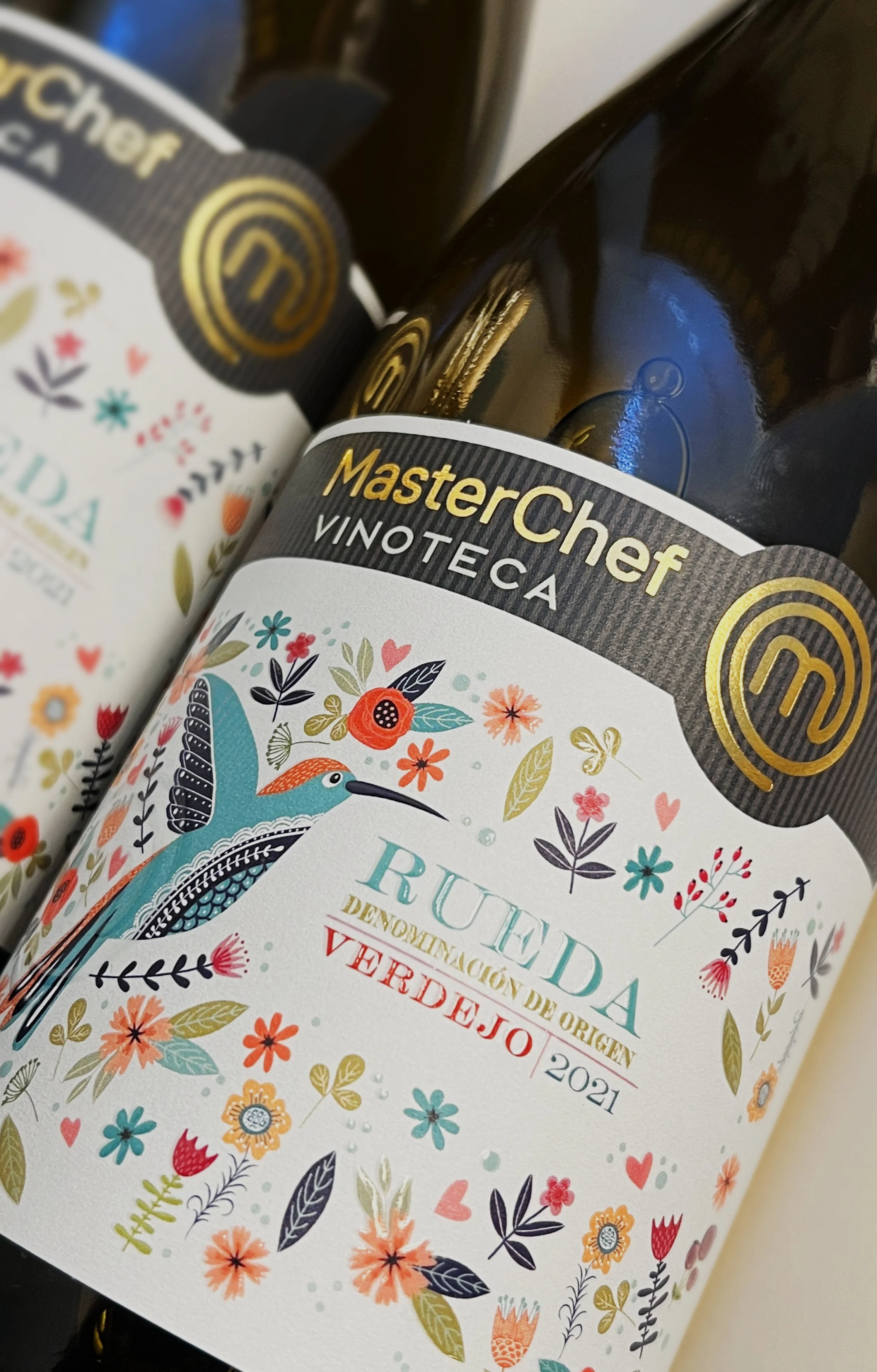
Masterchef is a globally recognized brand with millions of followers. It is a global entertainment phenomenon that celebrates passion and creativity in the kitchen.
Masterchef Vinoteca selects iconic wines, representative of each of the world's wine regions.
The work of Razonable consists of giving each label of these wines its own personality so that the consumer simultaneously recognizes the seal of guarantee of the Masterchef brand and the values and identity traits of each of the wine regions represented.
For the brand Nütots we developed an integral branding and packaging project for its range of baby hygiene products: diapers, wet wipes, cotton swabs, among others.
We created the name, visual identity, packaging and communication tone.
The aesthetic proposal is based on a palette of pastel colors and cute illustrations of origami animals commissioned ad hoc to Luis Echanove, which reinforces the softness, care and tenderness that the brand conveys. Nütots combines functionality and visual charm, standing out on the shelf thanks to a coherent, friendly and memorable graphic universe.
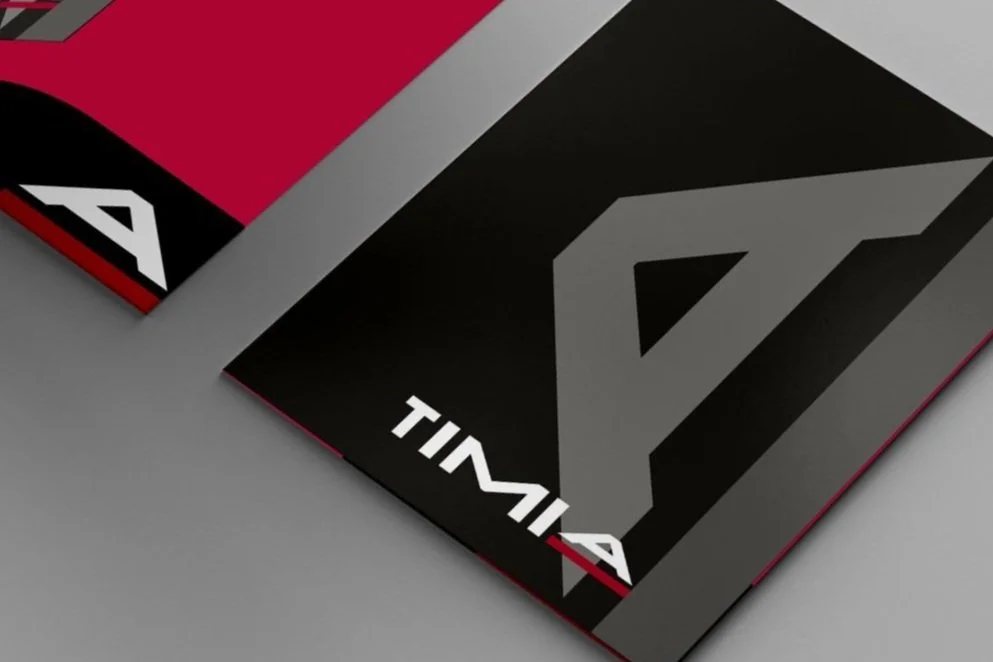
Timia is a technology consulting firm that applies an ethical use of artificial intelligence in its processes. At Razonable we create the brand from scratch, including its positioning and concept, the name, the visual identity and its communication and marketing system and strategy.
Grassy is an emblematic brand of jewelry and watches with more than 90 years of history. Its emblematic store at number 1 Gran Vía in Madrid has become an icon not only for the brand, but also for the city itself.
The razonable work for grassy has consisted in updating the brand without losing the values that the family has been transferring from generation to generation. We repositioned the brand based on the legacy and close ties with the art world. From there we redesigned the logo and other elements of the visual identity (packaging, shop windows, advertising, website, etc.). A fundamental part of our collaboration with Grassy is to help the brand to express itself with these new values in all its different manifestations.
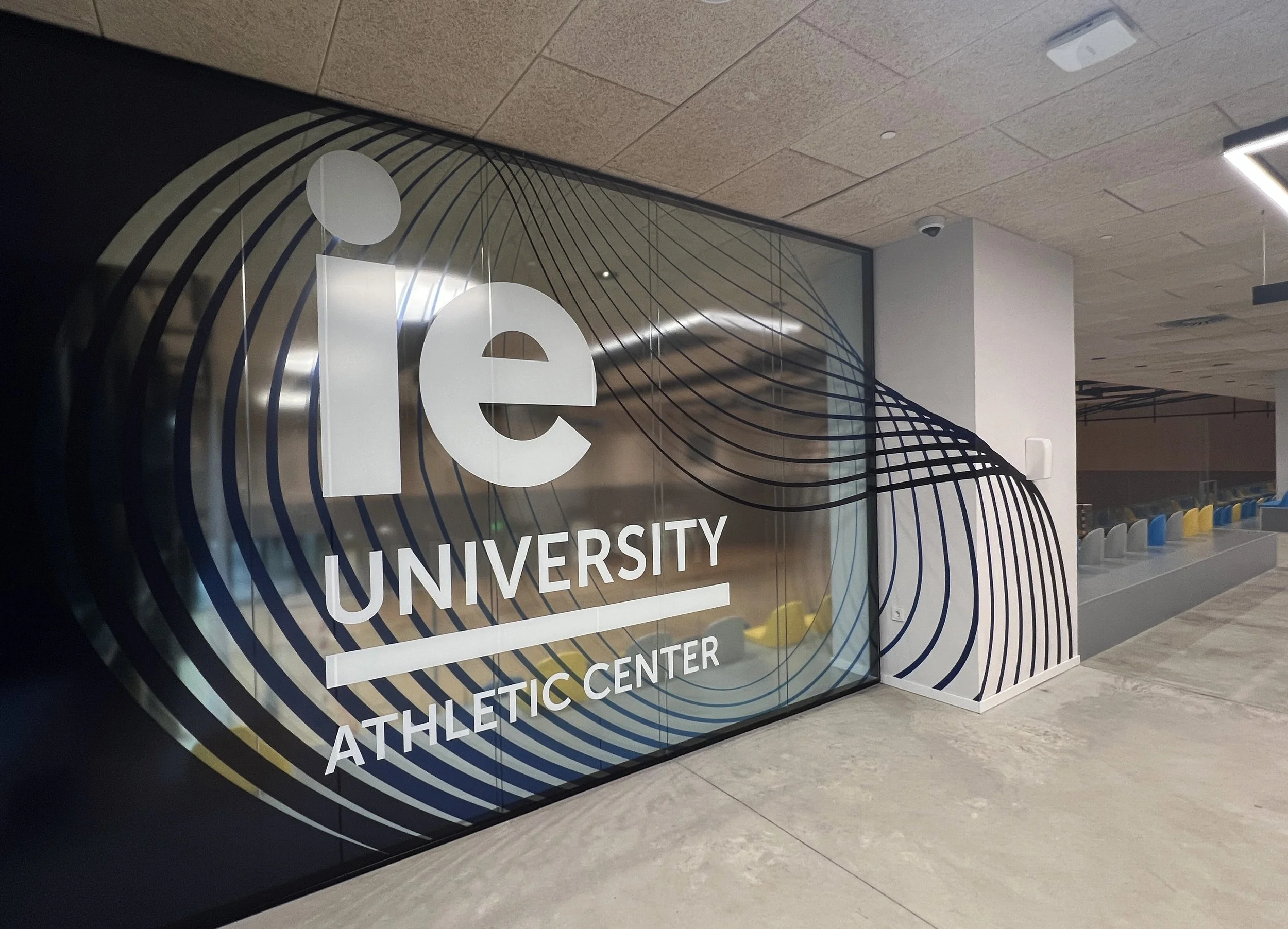
IE University is currently one of the most prestigious universities in the world and its vertical campus in the ie tower in madrid is the tangible image of this. the work of Razonable in this project consisted of providing all the common areas of the athletic center of the IE Tower with a setting that, while maintaining the principles of sustainability, diversity and sportsmanship, reflects the multi-national university spirit of the users of these facilities.
Clubö is a branding work done in collaboration with Balthazar. It is a brand of urban parking lots with more than 20 locations in 14 cities in Spain.
The brand we created (concept, positioning, name and visual identity) offers its more than 11,000 customers a daily experience that pivots on these six strategic axes: electricity, sustainability, technology, convenience, meeting point and flexibility.
Cunef is an educational institution with a long history of enormous prestige. To communicate its different executive programs, Razonable has created a system of publications based on the brand's corporate square, which, flexibly modulated, creates a language that is recognizable as unique to Cunef.
Ilusiak is a boutique operations outsourcing consultancy that commissioned us to create their brand.
Our task was divided into two phases: first, we carried out a brand consulting work from which we developed a concept of expert efficiency and a positioning that combines flexibility, proximity and seniority. the second part consisted in the creation of a visual identity in accordance with this concept and positioning and then the application of the same to the different communication supports, corporate identity, etc.
The renewal of the Alter brand is the result of a new collaboration between Razonable The result is a work of harmonization that works in two directions: on the one hand, it updates and homogenizes the visual features of the brand, which were very scattered and varied until now, and on the other hand, it organizes the group's brand architecture in a rational way and in accordance with both its complex internal organizational structure and the perception of the brand in the different markets in which the group operates.
The result is a visual identity that evolves from the previous one without breaking with the group's historical legacy and at the same time takes off on a new flight more in line with the needs of contemporary brands.
The work of Razonable for Bluetab gives personality to a brand that already had a visual identity. We worked with the client to develop a new positioning: "pioneering strategic business technology". this positioning implies the development of a new visual identity in which, on the one hand, a chromatic range is created that synthesizes the balance between the company's technology and passion, and on the other hand, images of historical pioneers are presented to symbolize the new positioning. all of this is reflected in the tagline created for the brand: "targeted innovation".
the visual expression of these new brand elements is manifested in their offices, their website, their daily work tools, etc.
Ibora is the brand we created for a new online art gallery that breaks down barriers, bringing exclusive works to audiences and markets that previously could not access them. Art without borders, within everyone's reach.
The brand acts discreetly but clearly, so as not to compete with the artwork. The role of the mark in this case is equivalent to that of the frame in a painting.
The branding work developed for Clousr by Razonable starts with the definition of its brand values and the creation of an innovative concept: Clousr is like a big brother that with its experience brings you knowledge and helps you to take advantage of the one you already have, in an agile, simple and reliable way.
This concept led us to a positioning that is expressed with the tagline "the empathy trigger" and with a visual language that reinforces the perception of closeness and empathy.
As part of the collaboration initiated in 2003 between Razonable and Saffron Brand Consultants, in 2004 and coinciding with the 75th anniversary of its foundation, we carried out the redesign of the Esteban Rivas brand. This is a brand with a strong regional presence in the Community of Madrid, but in reality it is part of a larger group that, under the same name, brings together, in addition to this occasional bus company, another van rental company, a small construction company and specialized parks for the transport of goods.
Esteban Rivas buses are the flagship of the group and the client was very specific when it came to requesting an animal that would symbolize the brand's values. after a long investigation, we concluded that the swallow represents regularity (it returns to its nests annually on the same dates), fidelity (it always returns to the same nest) and trust (it is a symbol of good luck in various cultures). In addition, it moves with agility and evokes something as positive as the onset of good weather.
Acuña is the pioneering consulting firm in economic and financial analysis and advice in the real estate sector in Spain. During the last 30 years, its clients from the public and private sectors and financial institutions have positioned them as a national and international reference in real estate asset transactions.
As the company celebrated its 30th anniversary in the market, it was the ideal occasion to update its visual identity, adapting it to the new times and technologies prevailing in the sector in which it operates. The result is a total renovation that ranges from the commercial name, which changes from "RR de Acuña y Asociados" to a simpler and more forceful "Acuña", to the design of a new logo, color palette, graphic resources and their corresponding applications, both online and offline.
Mackenzie's summarizes in a simple label all the tradition of classic American whiskeys and the most contemporary consumer trends.
It is a brand aimed at an urban public that has traditionally favored other spirits, but is also attracted to products that convey a certain heritage and tradition in an updated form.
Pavalgan is a real estate developer that was born with the clear vision of becoming the benchmark in the rehabilitation of classic properties for their transformation into high-end residential properties. Pavalgan's aim is to develop its activity in medium-sized cities and always guided by an exquisite attention to detail that is summarized in the strapline that we developed for the brand: "excellence and uniqueness".
The visual expression of the brand that we create plays the role of a frame to contain the different promotions that they develop, raising the perception of them and providing a common thread to all the pieces, coherent and sophisticated that unites tradition and modernity.
Solar de Samaniego is a Rioja winery with a long tradition. In 2015 it undertook the repositioning of the brand under a new concept that revolves around the world of literature: "drinking between the lines".
Following this pattern, the new design of its Crianza and Rioja labels is intended to evoke the world of fantasy and imagination of literature, with direct reference to the fables of Samaniego, ancestor of the family that owns the winery, whose ancestral home was located on the land where the vines of Solar de Samaniego now grow.
Razonable to carry out this work has redesigned the brand logo, the range of labels and boxes, as well as the point-of-sale display material and other brand elements.
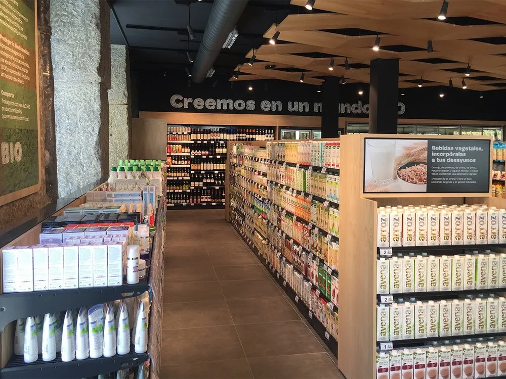
The organic products market is in full expansion and carrefour is well aware of this and for this reason has launched in spain a new concept of establishment in which 100% of its references are organic. this project has been carried out in collaboration with Balthazar, inspired by the chestnut wood baskets that have been used in a traditional way in spain. To evoke this element we created an undulating texture of chestnut wood as a false ceiling and all the furniture of the establishment is made of the same chestnut wood.
The project includes not only the design of the entire space of the establishment, furniture, lighting, etc., but also all the graphic and visual identity of this new ensign: logo, creation of an ad hoc bio typography, visual language, communication, bags, etc.
When a large bank like BBVA needs to convey the need to face the digital challenge to its employees, it develops tools aimed at facilitating their training in this new challenge. In Razonable we have participated in this project with the design of the documentation used in this training.
The brand created for the d'Agustto pizzeria shows its young and transgressive spirit while still reflecting the Mediterranean character of its handmade pizzas. this combination results in a very dynamic and flexible visual identity, full of color and at the same time solid and forceful.
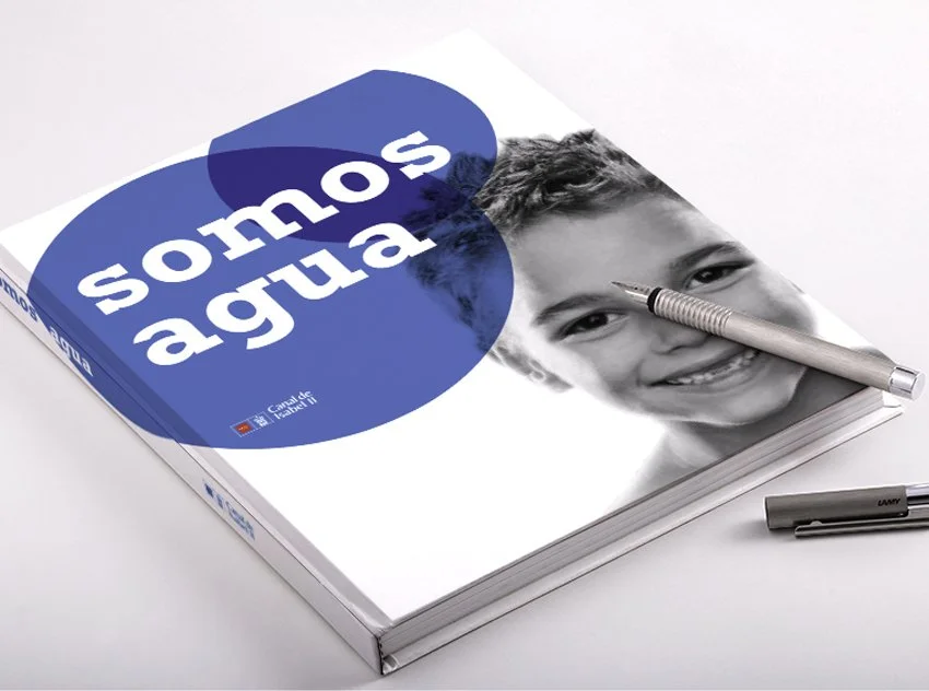
Design of the book Somos Agua for the publication contest of Canal de Isabel Segunda
Brand consulting, strategic branding and packaging design for marketing managers in Madrid. B2B approach, startups and SMEs with measurable results. Direct contact from Chamberí, Salamanca and downtown area.
Brand consulting is the starting point for companies that need strategic clarity before investing in communication or design. Razonable works with marketing managers in Madrid who are looking for diagnosis, positioning and brand architecture with a B2B approach.
Complete brand audit: Internal and external perception analysis, competitor mapping, touch point consistency assessment.
Strategic positioning definition: Identification of real differentiators, unique value proposition and communication tone adapted to the sector.
Brand architecture: Organization of sub-brands, product lines and hierarchies when the company grows or diversifies.
Brand platform: Strategic deliverable that includes purpose, values, personality, attributes and brand narrative.
Each consultancy includes collaborative work sessions, executive presentations and clear implementation guidance.
Rebranding is not just changing the logo: it is rethinking the brand from its purpose to its visual expression. Razonable manages rebranding processes for SMEs and B2B companies in Madrid facing market changes, mergers or strategic evolution.
Rebranding of SMEs in Madrid with brand audit included: Previous diagnosis, transition strategy, identity redesign and change communication plan.
Corporate identity redesign: Updating of visual system, palette, typography, applications and complete brand guide.
Internal change management: Communication to teams, training in new values and support in the progressive implementation.
Especially suitable for technology, fintech, health and professional services companies in downtown Madrid, Chamartín and business areas in the northwest.
Packaging design requires strategic vision and technical knowledge. Razonable works on packaging projects for food, beverage, cosmetic and artisan brands in Madrid.
Food packaging design in Madrid: Differentiation strategy on the shelf, structural design, graphics and coordination with local suppliers.
Beverage packaging in Madrid: From craft beer to vegetable beverages, design that connects with the final consumer.
Wine label design in Madrid: Labels that transmit origin, quality and personality of the winery. Coordination with specialized printers.
Cosmetic packaging: Sustainable, elegant and functional design for natural or premium cosmetic brands.
Sustainable packaging design: Selection of recyclable materials, ecological inks and certified suppliers.
Each project includes prototyping, consumer validation and production follow-up.
Naming is one of the most critical decisions in the launch of a brand or product. Razonable develops creative naming processes for startups, product launches and rebrandings in Madrid.
Creative naming in Madrid: Strategic generation of memorable, differentiating and registrable names.
Naming for tech products in Madrid: Names that work in digital environments, with available domain and linguistic validation in several languages.
Naming for startups in Madrid: Agile process adapted to quick launches, with verification of brand and domain availability.
Complete process: Strategic brief, creative generation, selection, linguistic validation, legal analysis and brand registration.
Especially oriented to technology, fintech, health and e-commerce sectors in Madrid.
B2B companies need brands that build trust, credibility and differentiation from competitors. Startups need brands that scale fast and connect with investors and customers.
Strategic B2B branding in Madrid: Decision-oriented positioning, results-based storytelling and professional design without frivolity.
Branding for startups in Madrid: Scalable, flexible and ready to grow without losing coherence.
Branding for SMEs in Madrid: Professional branding without cost overruns, with clear prioritization of resources and focus on the essentials.
Projects developed for technology companies, consulting firms, agencies, SaaS platforms and professional services in downtown Madrid, Chamberí, Salamanca and Chamartín.
Each sector has its own codes, references and expectations. Razonable adapts the strategic and creative approach according to the target market.
Technology brand consulting in Madrid / fintech / health: Brands that convey innovation, security and leadership. Focus on tech companies, digital platforms, healthtech and fintech in Madrid.
Branding for food and beverage: Brand strategy for artisan products, functional beverages, wines, craft beers and gourmet products.
Branding for cosmetics: Premium, natural or sustainable identity according to positioning. Differentiating packaging and coherent brand narrative.
Branding for real estate: Branding for developers, real estate projects and proptech in Madrid.
Each sector requires specific knowledge of its channels, customer pain points and competitive dynamics.
The work process is designed to minimize risks, maximize impact and ensure successful implementation.
Diagnosis and briefing: Initial strategic session, analysis of current situation, objectives, competition and target audience.
Research and analysis: Brand audit, competitive benchmarking, trend analysis and hypothesis validation.
Strategy: Definition of positioning, value proposition, brand attributes and architecture if applicable.
Creativity: Naming (if applicable), visual identity design, branding system and key applications.
Validation and adjustments: Executive presentation, iterations based on feedback and technical/legal validation.
6. Delivery and implementation: Complete brand guide, final files, internal training and launch support.
Each project includes clear milestones, progressive deliverables and strategic review sessions.
Real strategic focus: We don't decorate brands, we build them from their purpose to their final expression.
B2B specialization: Experience in companies that sell to companies, where trust and credibility are critical.
Direct deal: No intermediaries or inexperienced juniors. You work with the project managers.
Proven methodology: Process validated in more than 50 projects for startups, SMEs and consolidated companies.
Knowledge of the Madrid ecosystem: We know the business dynamics of Chamberí, Salamanca, Chamartín, northwest business areas and technology parks.
Measurable results: Brands that impact perception, differentiation and business results.
Razonable is not the biggest or the cheapest agency. It is the agency that prioritizes strategic impact over visual decoration.
We work with companies located in the main business centers of Madrid: Las Rozas business park, Pozuelo, Alcobendas, San Sebastián de los Reyes, Tres Cantos and central Madrid (Chamberí, Salamanca, Chamartín).
Availability for face-to-face meetings at the client's offices or in our studio. Flexibility for hybrid projects (face-to-face + remote) according to the team's preferences.
The craft beverage sector (beer, kombucha, vermouth, gin, spirits, functional beverages) requires brands with personality, differentiation and impactful packaging design.
Brand strategy: Clear positioning in a saturated market, authentic brand narrative and visual differentiators.
Naming: Memorable, registerable names that work at the counter, on the shelf and online.
Packaging design: Labels, cans, bottles with design that connects emotionally and stands out at the point of sale.
Coordination with suppliers: Printers, labelers and suppliers of sustainable packaging in Madrid and surroundings.
Complete projects from strategy to final implementation.
E-commerce needs brands that generate instant trust, differentiate themselves in digital environments and scale without losing coherence.
Branding for e-commerce: Visual identity adapted to mobile, naming with available domain, close and professional communication tone.
Packaging for shipments: Memorable unboxing experience, sustainable materials and design that reinforces the brand.
Digital branding: Web applications, social media, email marketing and online advertising.
Especially oriented to DTC (direct to consumer), own marketplaces and product startups in Madrid.
It includes brand audit, positioning definition, brand architecture, strategic platform, visual identity system and application guide. All coordinated by Razonablebranding agency in Madrid with a B2B focus.
We started with brand diagnosis and audit, followed by competitor and target audience analysis, designed the positioning strategy, developed the brand platform and delivered the complete guide with visual system.
Specialized in B2B, technology, fintech, health, food and beverage, cosmetics and real estate. We work mainly with startups, SMEs and companies in Madrid looking for strategic differentiation.
Genuine strategic approach without unnecessary decoration. Direct contact with project managers. Experience in B2B and launches. Validated process and measurable results. In-depth knowledge of Madrid's entrepreneurial ecosystem.
A complete branding project takes between 8-12 weeks. Naming can be developed in 4-6 weeks. Rebranding varies according to complexity, usually 10-14 weeks. Each project includes clear milestones and progressive deliverables.
Yes, our naming service includes naming strategy, creative generation, linguistic validation, domain and brand availability analysis, and registration process. Specially oriented to tech products and startups in Madrid.
Packaging strategy, structural design, graphic design, prototyping, selection of sustainable materials and coordination with suppliers. Specialization in food, beverages, wine and cosmetics in Madrid.
Yes, although we are based in Madrid and work on-site in Chamberí, Salamanca, Chamartín and the northwest area, we also develop projects remotely for companies all over Spain.
No intermediaries: You work directly with the strategists and designers responsible for the project.
Transparent methodology: Clear milestones, progressive deliverables and validation sessions at each phase.
Strategic approach first: We don't start by designing. We first define what to communicate and why.
B2B experience: We understand B2B sales dynamics, long cycles and multiple decision makers.
Real implementation: We don't just deliver files. We accompany the implementation and train internal teams.
More than 50 branding, naming, rebranding and packaging projects for technology companies, fintech startups, food brands, artisan beverages, consulting and professional services companies in Madrid.
Measurable results: improved brand perception, clear differentiation from competitors, increased conversion rate of commercial proposals and reduced friction in B2B sales processes.
Start with the logo: Visual design is the consequence of strategy, not the starting point.
Imitating the competition: Genuine differentiation comes from understanding what makes you unique, not from looking like others.
Undervaluing naming: A bad name forever conditions brand perception and growth.
Lack of coherence: Brands that say one thing on the web and another in commercial dealings lose credibility.
Not validating with the market: Designing based on personal tastes instead of strategic criteria.
With Razonablethese mistakes are avoided thanks to strategic methodology, progressive validations and focus on business results.
A well-built brand is not an expense, it is an investment that generates measurable return:
Competitive differentiation: It stands out in saturated markets and justifies premium prices.
Accelerated trust: Reduces friction in B2B sales processes and shortens decision cycles.
Scalability: Brand prepared to grow without losing coherence or identity.
Talent attraction: Strong brands attract better professionals and facilitate team recruitment.
Company value: Professional branding increases the valuation of the company in investment or sales processes.
Companies with a well-defined strategic brand close more business proposals, attract better clients and build stronger relationships.
Preparing a launch, rebranding or looking for real differentiation in Madrid? Request a brand diagnosis with Razonable and discover how your brand can generate strategic impact.
Direct attention, response in less than 24 hours and without obligation. More than 50 B2B companies, startups and SMEs in Madrid have already trusted our strategic process.
Availability for face-to-face meetings in Madrid center, Chamberí, Salamanca, Chamartín, Las Rozas, Pozuelo, Alcobendas and main business areas.