Over the years razonable carried razonable numerous projects for a wide variety of clients. Some of these Projects been large-scale, while others have been smaller in scope, but all of them have been equally important to us and our clients.
In this page we present a brief sample of some of these projects that, although the years go by, we do not want to leave in oblivion because they are a fundamental part of our history.
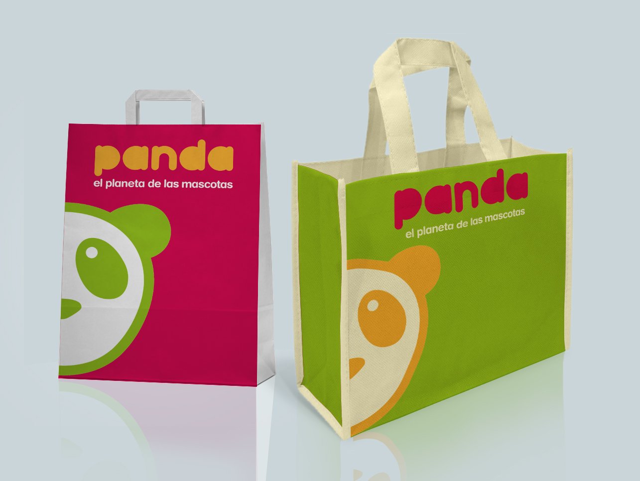
Panda
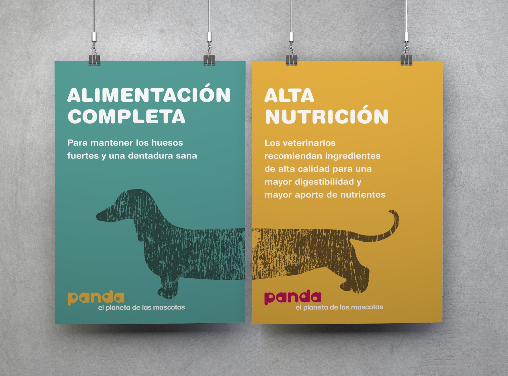
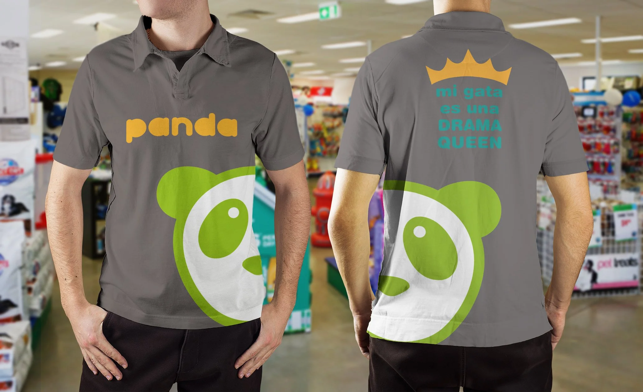
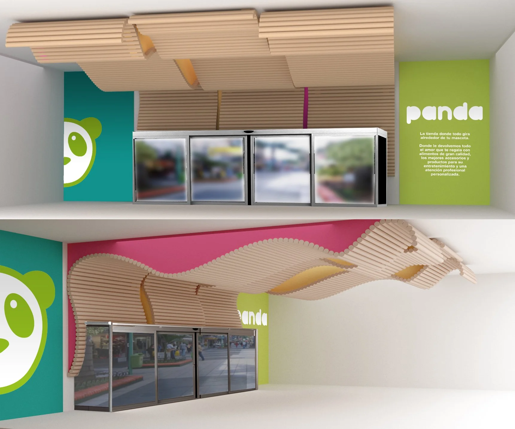
Panda is the brand created by Razonable in collaboration with Balthazar for the new pet store of the Carrefour group. A concept of macro pet food and accessories store, which wants to emphasize the closest and friendliest side that a specialist can offer.
For this design, in addition to the name itself, we developed the retail concept of the establishment in which, with a contained investment, we created an access space to the store with a strong personality based on recycled materials such as cardboard tubes.
Graphically, a palette of vibrant colors was created that can be freely combined with each other to give each expression of the logo a different perception, while maintaining the logo and the brand unchanged.
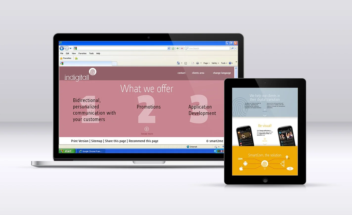
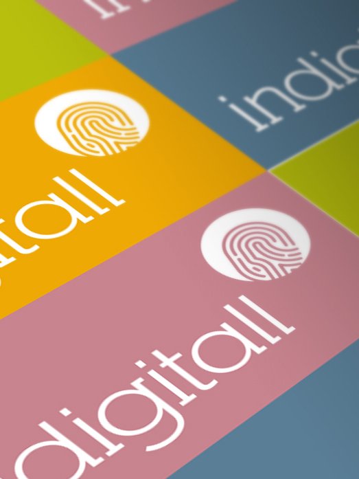
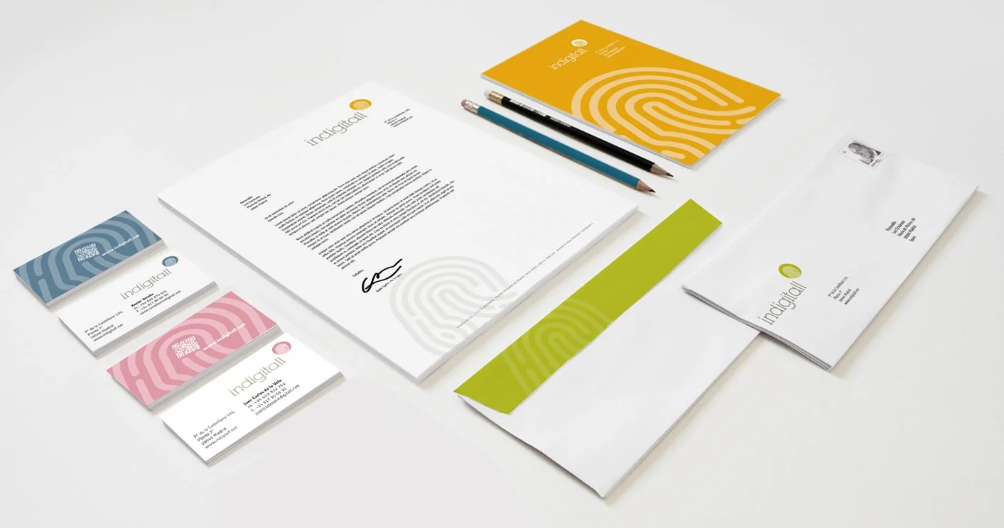
Indigitall
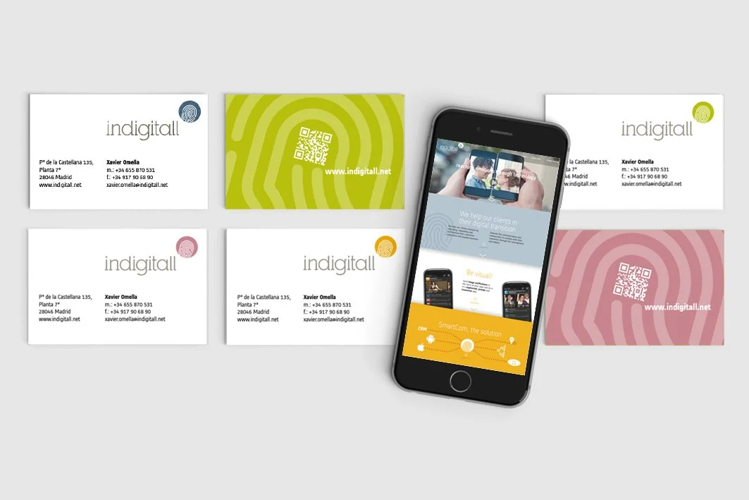
Indigitall is the platform that has developed innovative push notifications with image, to achieve instant, enriched, segmented and interactive communications between brands and their customers and users.
The project Razonable in this project consisted of developing the brand positioning: Reaching emotions through technology and creating its visual identity in a way that would reinforce that positioning.
The use of the fingerprint as a symbol refers, on the one hand, to the absolute personalization with which this platform allows communications to take place and, on the other hand, it is the explicit image of the point of contact between sender and receiver on this platform: the finger on the screen of the mobile devices.
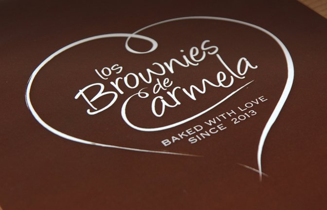
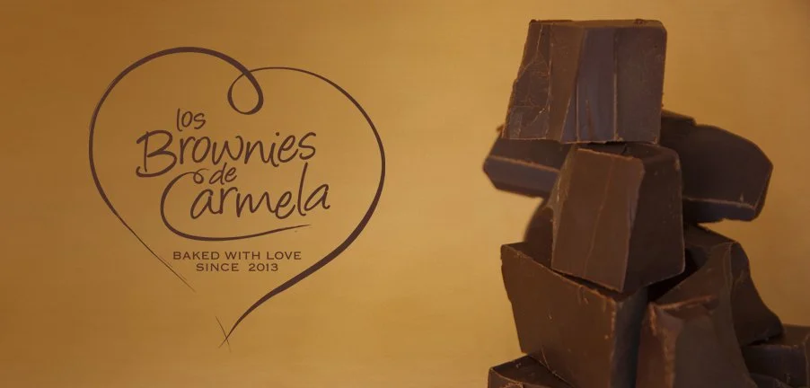
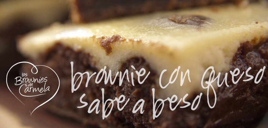
Carmela's Brownies
There are many brownies, but none like Carmela's Brownies. In this project, it was very clear from the outset that, although the quality of the product, handmade with the finest ingredients, was exceptional, Carmela's brownies were much more than that. The aim was to create the idea of the brownie as an object of desire and a gift. A perfect substitute for the traditional bottle of wine that is brought as a courtesy when invited to a friend's house or the hackneyed bouquet of flowers for special occasions.
With this premise we created a visual identity that started with a logo that directly evokes the affection with which the product is made, then declined in a very careful packaging and a style of communication in social networks in which Carmela became a real character who was the close and direct interlocutor with customers.


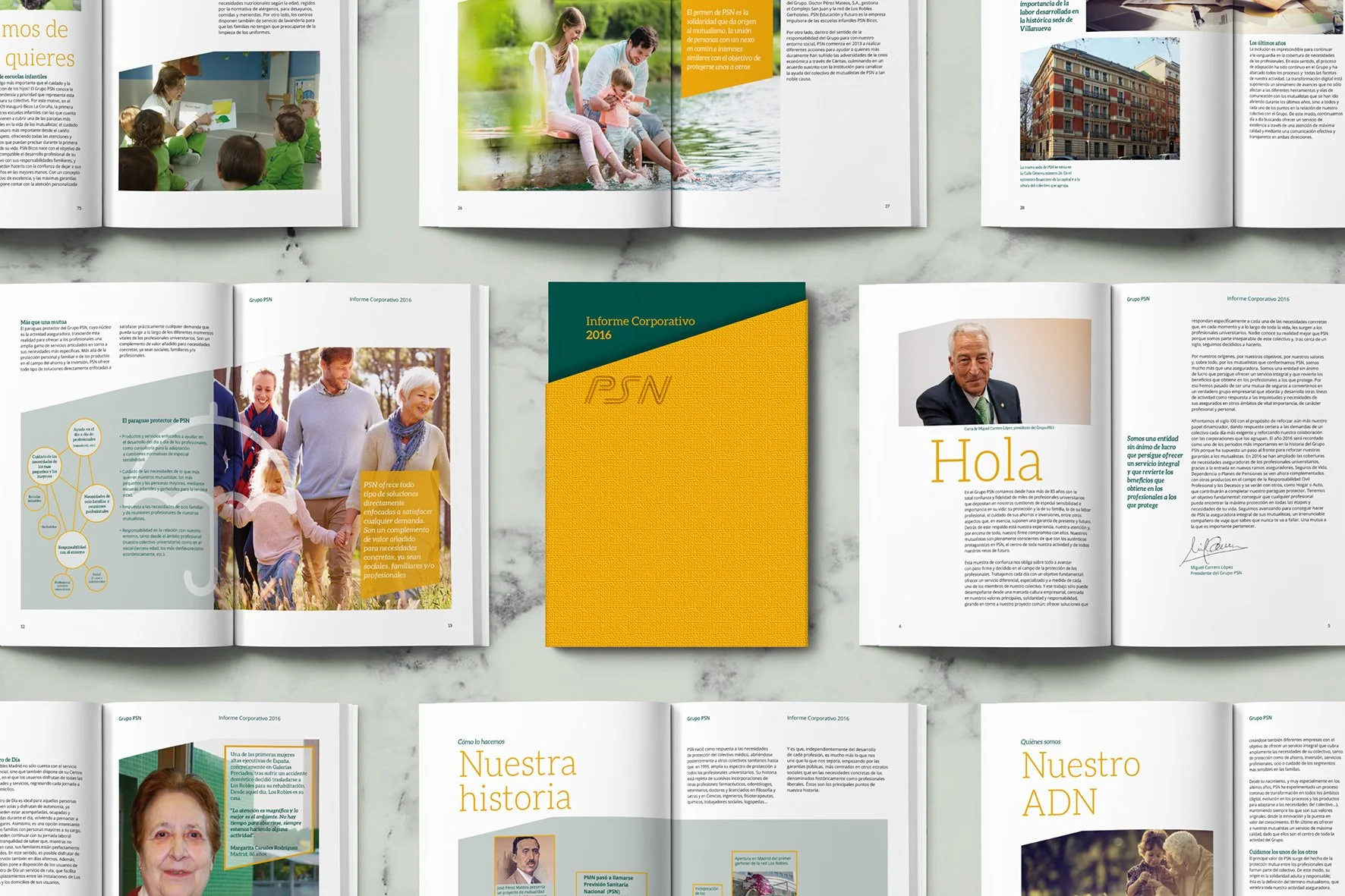
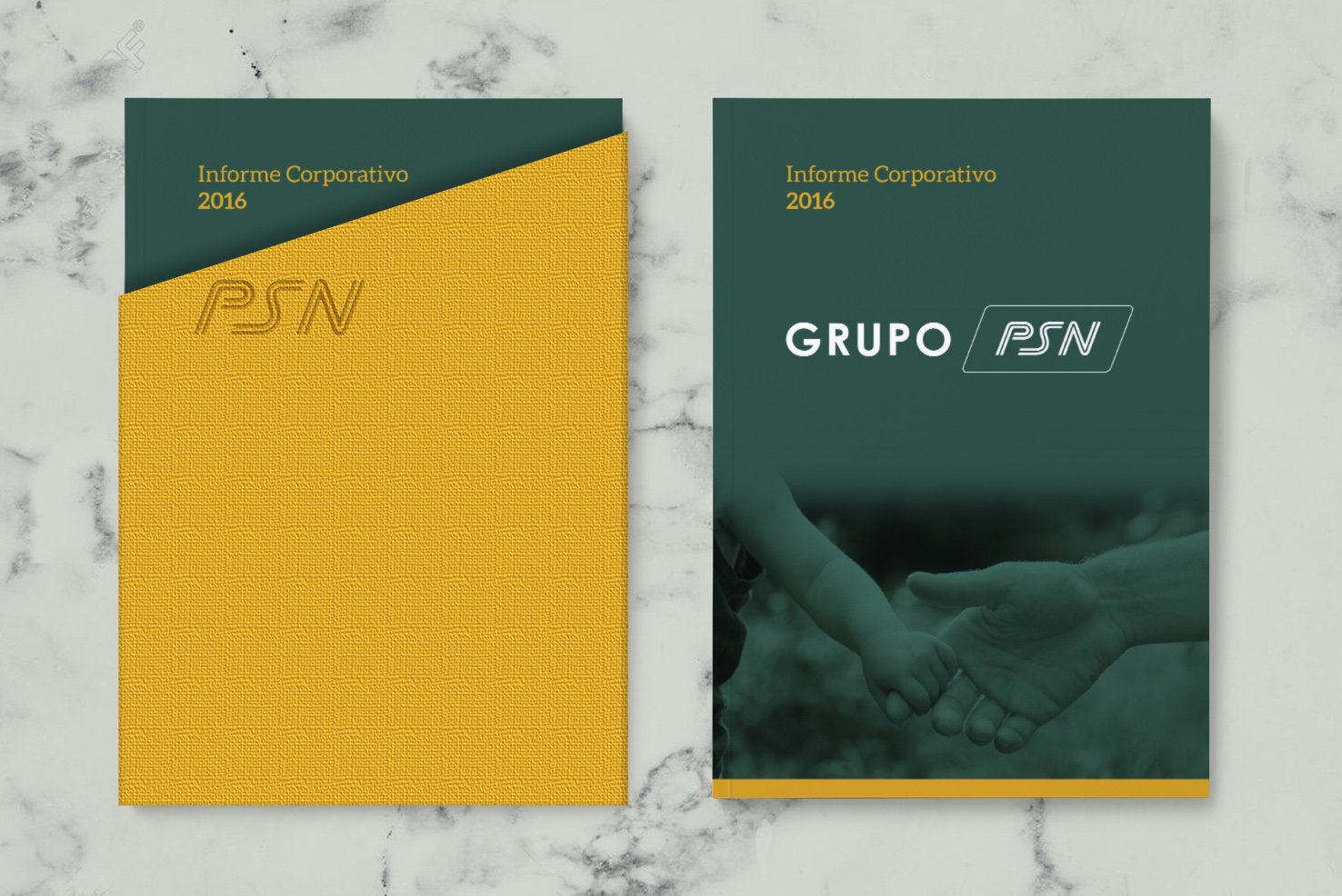
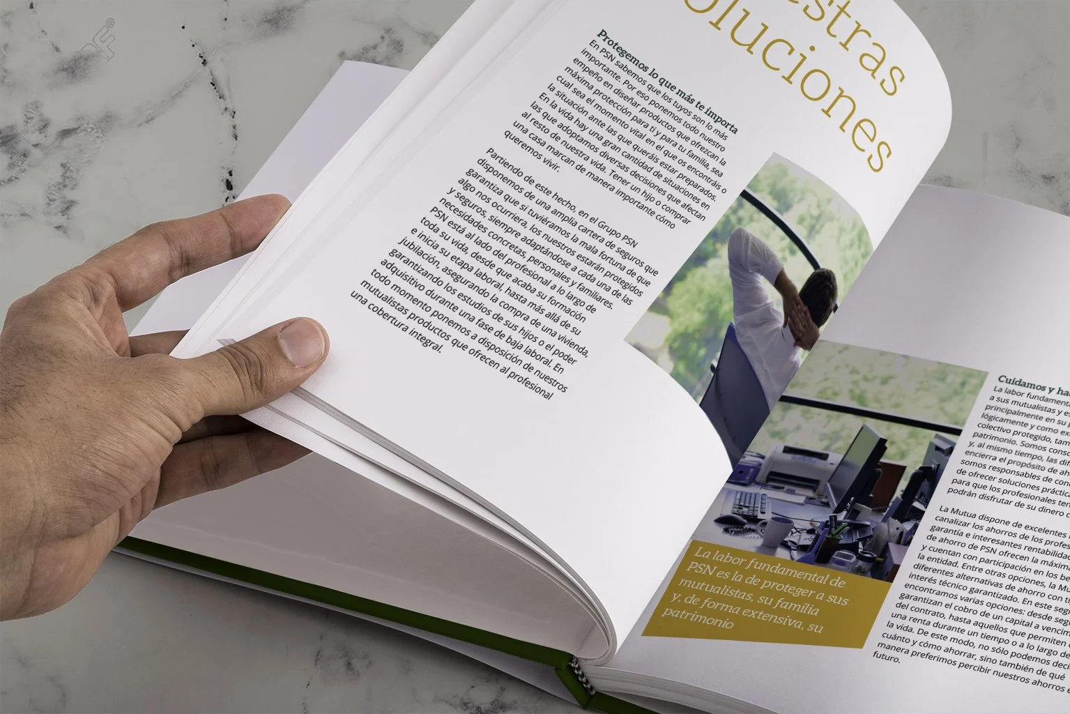
PSN
PSN is more than an insurance company, it is a company with social responsibility implicit in its DNA. The design by Razonable for its 2016 corporate report extols the company's values and explicitly highlights its social commitment.
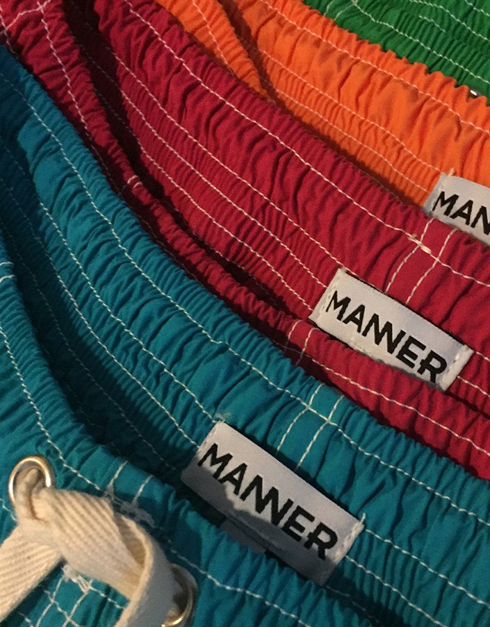
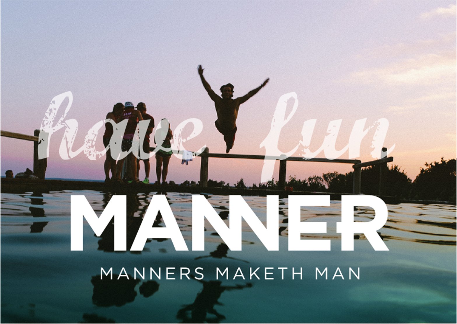
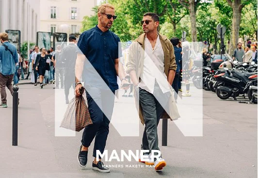
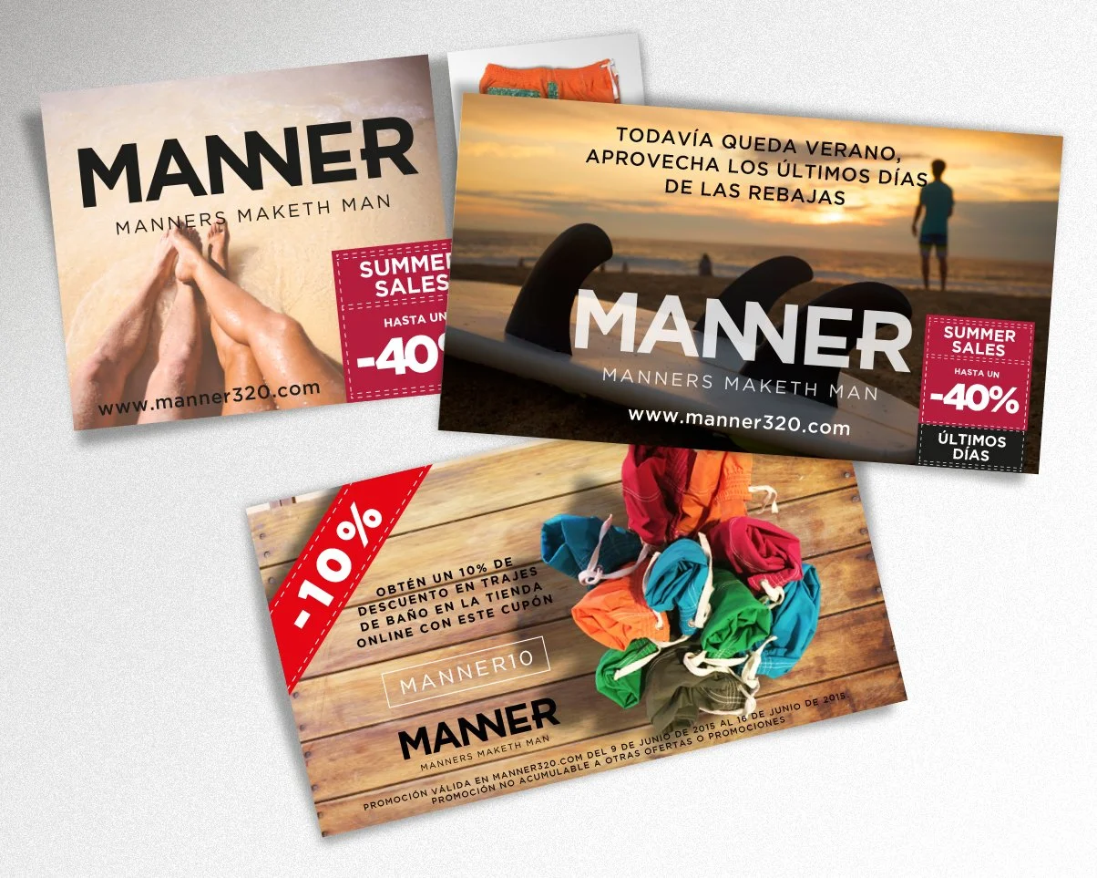
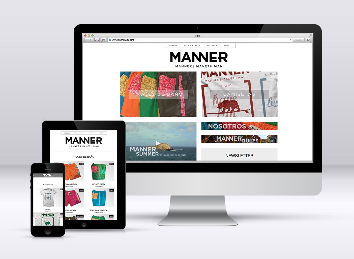
Manner
Manner is the street style fashion brand for men that combines a series of characteristics that make it an innovative concept in its category. Manner is aimed at an urban public concerned about their appearance in a discreet and elegant way. Care for details is an essential part of Manner and all this is expressed through the strapline we adopt: "Manners maketh man", a classic English saying that sums up in three words what this brand represents. To complete the equation, the product is designed and produced entirely by hand in Spain.
For a brand with such a strong emotional charge, razonable developed the concept and positioning, its visual expression and communication style. A simple yet powerful logo that unfolds in black and white together with lifestyle images that reinforce the brand positioning. All this is reflected in all the pieces developed by razonable manner (online store, communication, etc.).
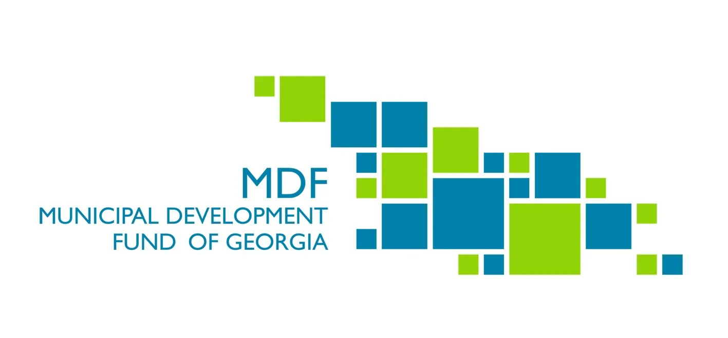
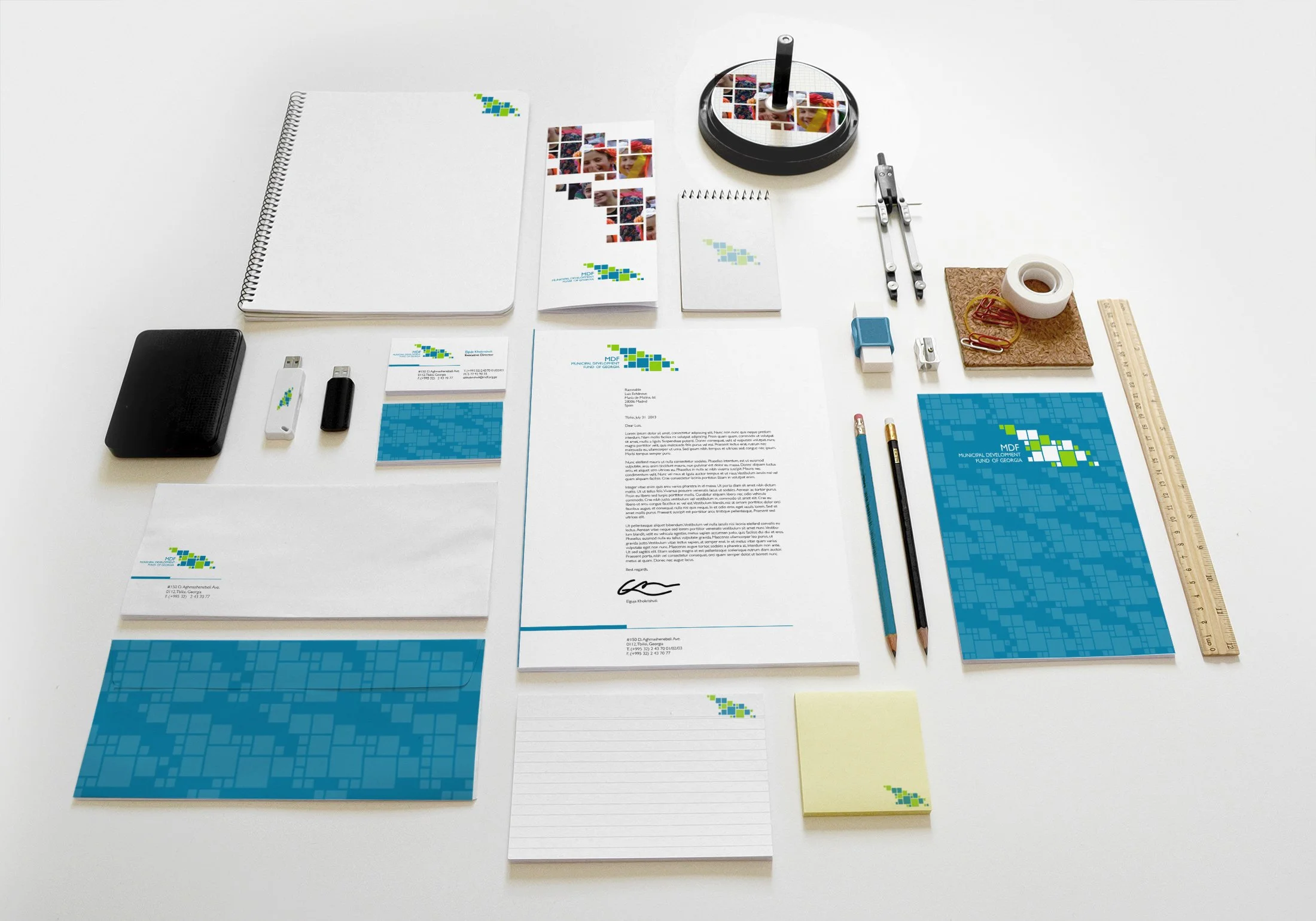
MDF
MDF is the municipal development fund of Georgia in the Caucasus. The brand created by Razonable for this institution reflects the idea of growth and at the same time the sum of many to achieve a common effort represented in this case by the map of Georgia formed by squares of different sizes and colors.
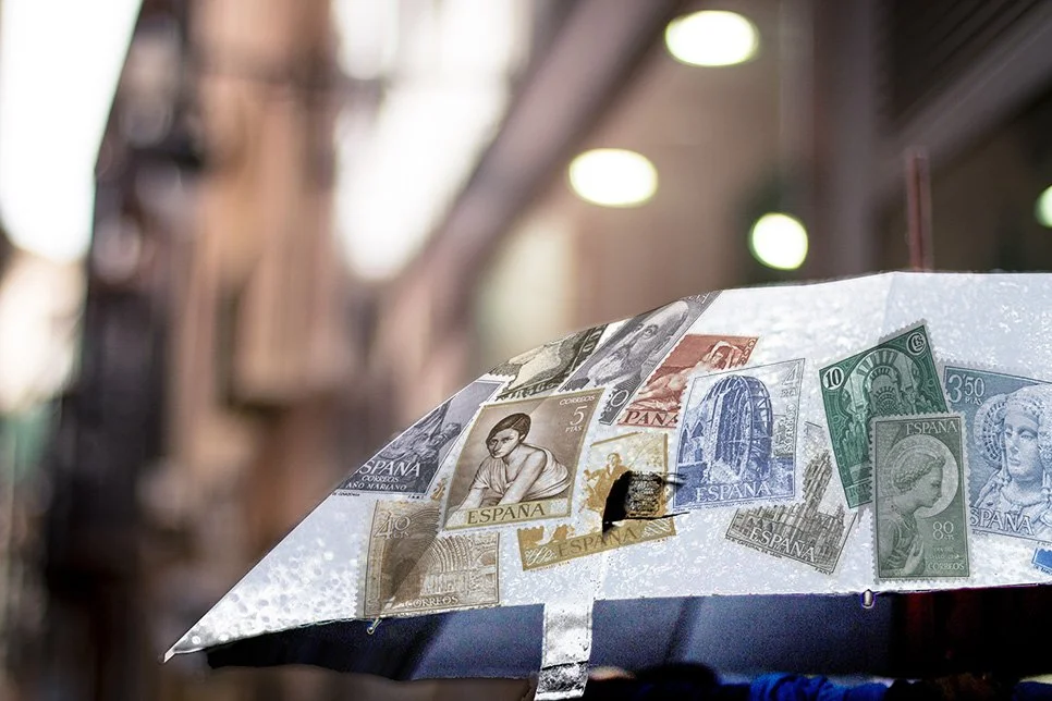
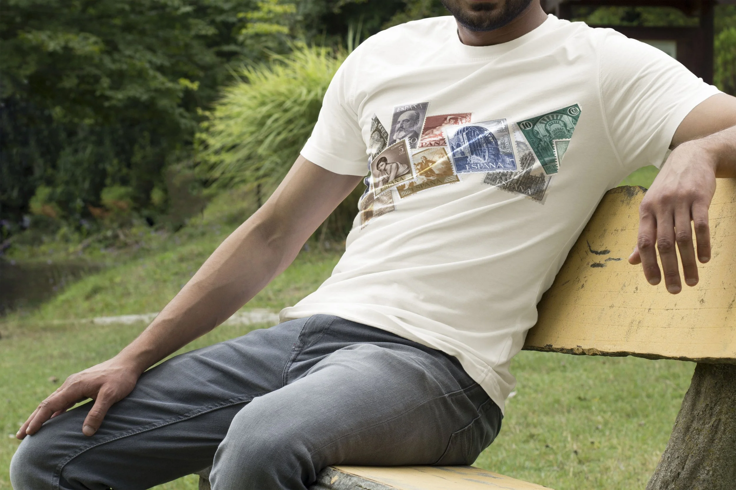
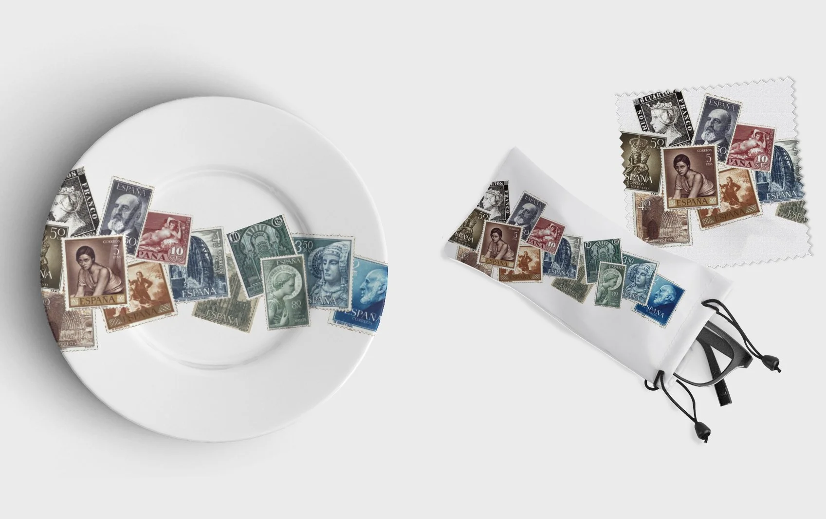
Correos
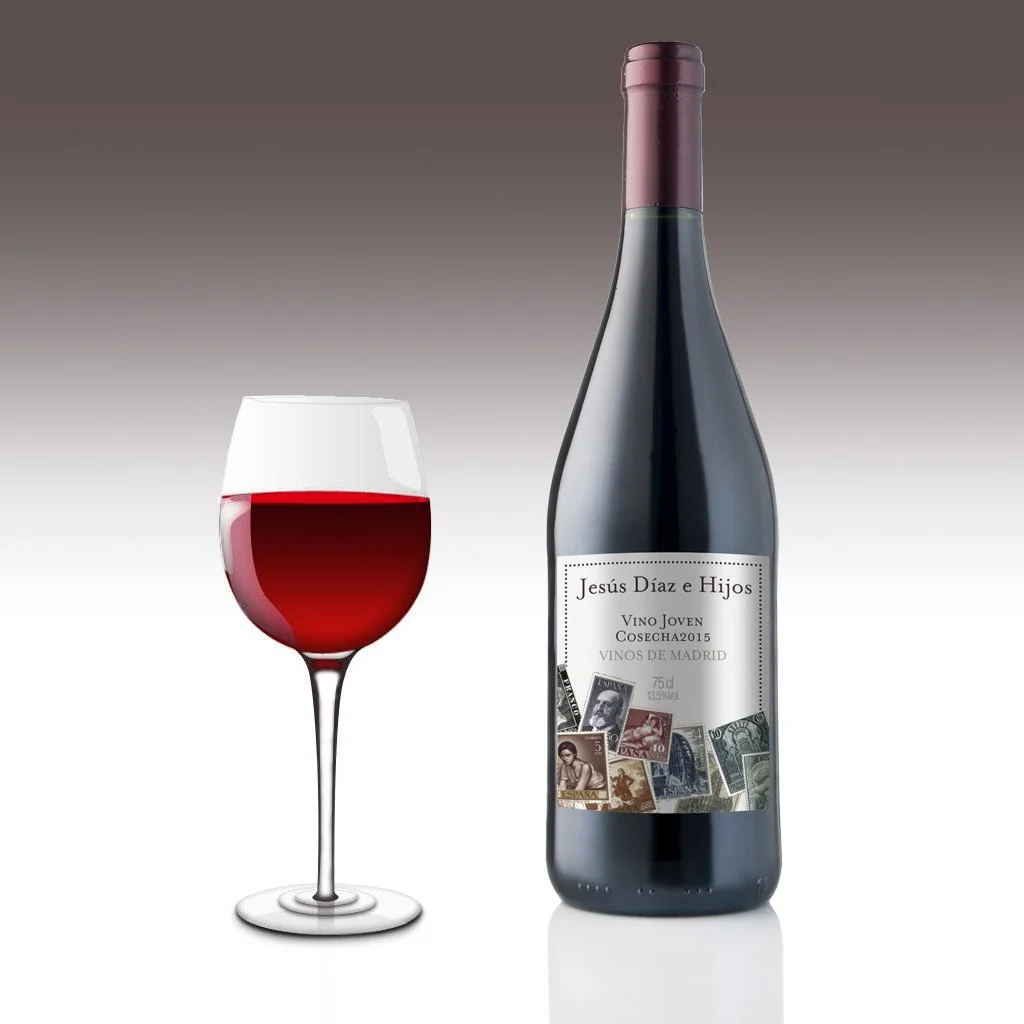
The agency Buenos Días relied on Razonable for the design of the pieces of the collection of products for philatelic correos. Under the idea of creating a powerful visual element directly related to the world of philately, a collage of historical correos stamps was created, which runs organically through the different elements of the collection: umbrellas, suitcases, bags, fans, plates, t-shirts, etc.

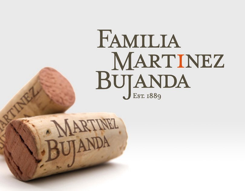
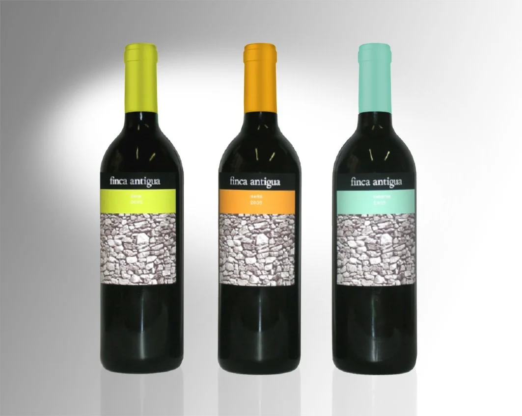
Familia Martínez Bujanda
As part of the collaboration between Razonable and Saffron Brand Consultants, we developed the brand project and label design project for Familia Martínez Bujanda, one of Spain's leading producers of quality wines.
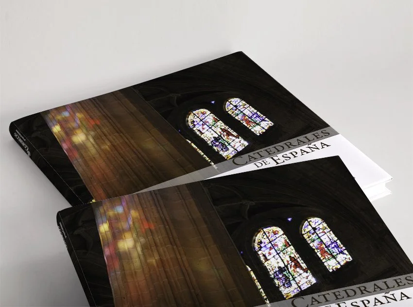
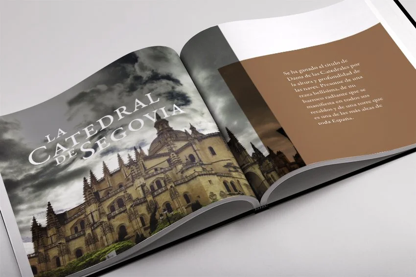
Correos
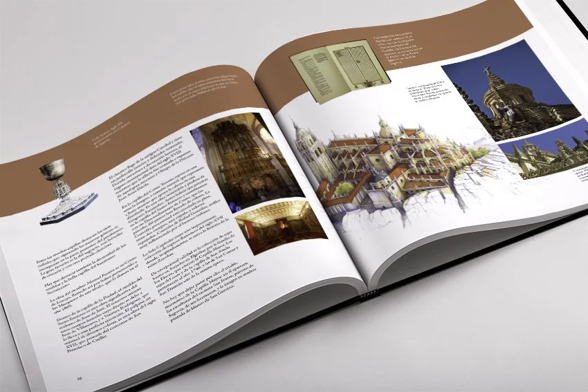
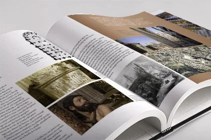
Design of the book Catedrales de España (Spanish Cathedrals) for the correos publishing contest.
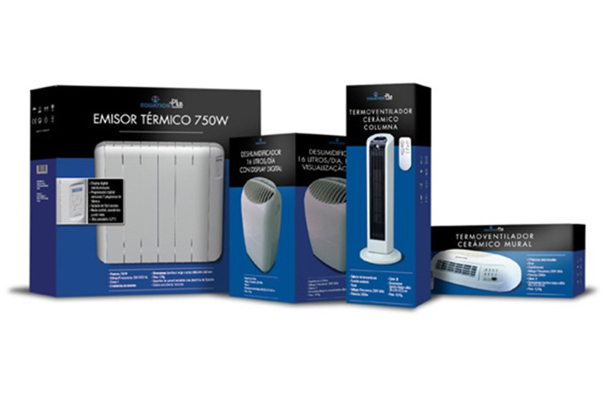
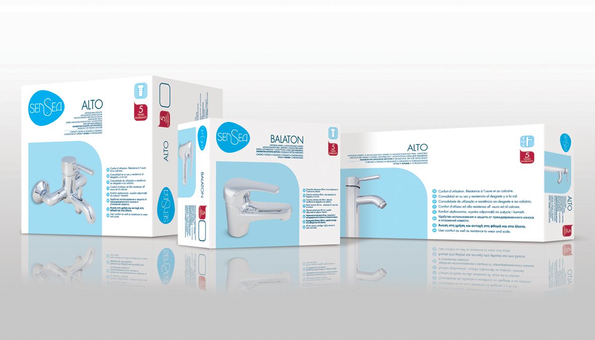
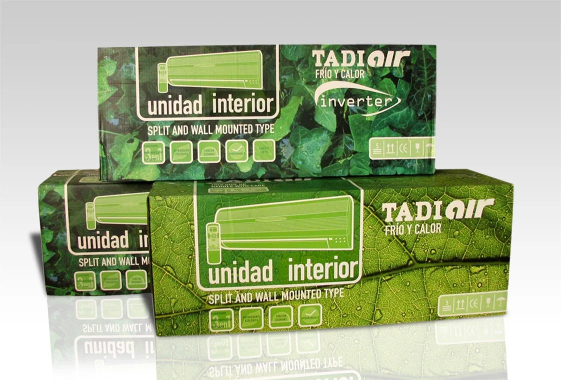
Leroy Merlin
Razonable has developed packaging for Leroy Merlin for various product ranges that this French retailer sells under its own brand throughout Europe.
The design of the line of air conditioners was carried out with the idea of evoking the thermal sensation they produce and fleeing from the technical and functional aspects of this type of products to, in this way, transform the act of buying from something technical and functional to an experience more similar to that of mass consumption.
Razonable also developed the entire range of packaging for Leroy Merlin's faucets for the whole of Europe, which meant that, in addition to the design implications, a great deal of logistical organization was required to coordinate the enormous number of references resulting from combining four faucet designs, each with more than five types of faucet and with the languages of the eleven countries where they are sold.
Other projects carried out for Leroy Merlin include the design of the packaging for the premium range of portable radiators, door entry systems, thermostats and television antennas.